Data Science Exercise: Predition Models with Python
In this post we are going to do a data science exercise, with python, which consists in the data exploration and models comparison to predict whether a person is earning more than 50.000$ a year. We will use a .csv dataset in which every row correponds to an adult and the columns correspond to their attributes. Our main goal is to determine if a person, based on some of the personal information, is likely to be have a good income or not.
Adult Income Prediction and Data Exploration
Requirements
The main requirements we need to do this exercise are:
- Install Python3
- Install Jupyter Notebook because our exercise will be done in a python notebook. If you don’t want to install
Jupyter, I recommend signin up in Kaggle and create a notebook there. - Install the following packages:
Download the dataset we will need to do our exercise by clicking here
If you already have Python3 and Jupyter, open a console and create a notebook.
$ jupyter notebook
Once you create your notebook, import the libraries we are going to use.
import numpy as np # linear algebra
import pandas as pd # data processing, CSV file I/O (e.g. pd.read_csv)
from sklearn.preprocessing import LabelEncoder
import datetime
import matplotlib.pyplot as plt
import seaborn as sns
import urllib
import os
We upload our dataset (Write the path were your dataset is located).
adult_income = pd.read_csv("./datasets/AdultIncome/adult.csv")
Alright. So far, so good. Let’s see how many features we have:
for column in adult_income.columns:
    print(column)
age
workclass
fnlwgt
education
education.num
marital.status
occupation
relationship
race
sex
capital.gain
capital.loss
hours.per.week
native.country
income
If you execute this statement below, you’ll see the first five rows of the dataset:
adult_income.head()
At first sight, the table seems to have null values. The education.num and education fields are the same, one is categorical and the other is numerical. Let’s have a statistical look at the numerical values.
adult_income.describe()
| age | fnlwgt | education.num | capital.gain | capital.loss | hours.per.week | |
|---|---|---|---|---|---|---|
| count | 32561.000000 | 3.256100e+04 | 32561.000000 | 32561.000000 | 32561.000000 | 32561.000000 |
| mean | 38.581647 | 1.897784e+05 | 10.080679 | 1077.648844 | 87.303830 | 40.437456 |
| std | 13.640433 | 1.055500e+05 | 2.572720 | 7385.292085 | 402.960219 | 12.347429 |
| min | 17.000000 | 1.228500e+04 | 1.000000 | 0.000000 | 0.000000 | 1.000000 |
| 25% | 28.000000 | 1.178270e+05 | 9.000000 | 0.000000 | 0.000000 | 40.000000 |
| 50% | 37.000000 | 1.783560e+05 | 10.000000 | 0.000000 | 0.000000 | 40.000000 |
| 75% | 48.000000 | 2.370510e+05 | 12.000000 | 0.000000 | 0.000000 | 45.000000 |
| max | 90.000000 | 1.484705e+06 | 16.000000 | 99999.000000 | 4356.000000 | 99.000000 |
As we see the statistics above, we can notice There might be some outliers in all numerical values. Just look at the capital gain and loss, see how the difference between the maximum value and the mean value is high.
What do we want to predict?
Our main goal is to predict if a person, given some certain features, has a high salary or not (A salary is considered high if it’s above 50,000$ per year). This is contained in the income target.
Exploring null values
We saw some values with interrogation signs (?) meaning those are null values but to make things easier, we’ll replace that sign by numpy null values.
adult_income = adult_income.replace('?', np.NaN)
Alright, let’s see how many null values we have in our dataset by typing this.
adult_income.isna().sum()
age                  0
workclass         1836
fnlwgt               0
education            0
education.num        0
marital.status       0
occupation        1843
relationship         0
race                 0
sex                  0
capital.gain         0
capital.loss         0
hours.per.week       0
native.country     583
income               0
dtype: int64
As we observe, workclass, occupation and native.country have null values. To make thing simple, we will replace these null values by other values instead of erasing the whole row containing a null value.
workclass
The workclass feature is categorical. So we’ll replace the null values setting the label Unknown.
adult_income['workclass'] = adult_income['workclass'].replace(np.NaN, 'Unknown')
adult_income['workclass'].isna().sum()
0
adult_income[adult_income['workclass'] == 'Unknown']['workclass'].count()
1836
occupation
The occupation feature is categorical. So we’ll replace the null values setting the label Other.
adult_income['occupation'] = adult_income['occupation'].replace(np.NaN, 'Other')
adult_income[adult_income['occupation'] == 'Other']['occupation'].count()
1843
Native Country
The native.country feature is categorical. So we’ll also replace the null values setting the label Other.
adult_income['native.country'] = adult_income['native.country'].replace(np.NaN, 'Other')
adult_income[adult_income['native.country'] == 'Other']['native.country'].count()
583
Now there are no null values
adult_income.isna().sum()
age               0
workclass         0
fnlwgt            0
education         0
education.num     0
marital.status    0
occupation        0
relationship      0
race              0
sex               0
capital.gain      0
capital.loss      0
hours.per.week    0
native.country    0
income            0
dtype: int64
Auxiliar functions
Before analyzing and exploring our dataset, We will create a auxiliar function to plot charts with certain parameters. Just copy this function and paste it into you notebook.
from matplotlib.ticker import FuncFormatter


def plot_features_income(data, column, type_names, size=(20, 10)):
    fig, ax = plt.subplots(figsize=size)
    barWidth = 0.25
    bars1 = list()
    bars2 = list()
    for col in type_names:
        dt = data[data[column] == col]
        count_up = dt[dt['income'] == '>50K']['income'].count()
        count_down = dt[dt['income'] == '<=50K']['income'].count()
        bars1.append(count_up)
        bars2.append(count_down)

    r1 = np.arange(len(bars1))
    r2 = [x + barWidth for x in r1]

    rects1 = plt.bar(r1, bars1, color='gold', width=barWidth, edgecolor='white', label='More than 50K $')
    rects2 = plt.bar(r2, bars2, color='tomato', width=barWidth, edgecolor='white', label='Less or Equal than 50K $')

    plt.xlabel(column, fontweight='bold')
    plt.ylabel('Income per number of people', fontweight='bold')
    plt.xticks([r + barWidth for r in range(len(bars1))], type_names, rotation=30)
    plt.minorticks_on()
    plt.grid(b=True, which='minor', color='#999999', linestyle='-', alpha=0.4)

    heights_1 = list()
    for rect in rects1:
        height = rect.get_height()
        heights_1.append(height)

    heights_2 = list()
    for rect in rects2:
        height = rect.get_height()
        heights_2.append(height)

    count = 0
    for rect in rects1:
        h1 = heights_1[count]
        h2 = heights_2[count]
        ptg = (h1 / (h1 + h2)) * 100
        ax.text(rect.get_x() + rect.get_width()/2., 0.99*h1,
            '%d' % int(ptg) + "%", ha='center')
        count = count + 1

    count = 0
    for rect in rects2:
        h1 = heights_1[count]
        h2 = heights_2[count]
        ptg = (h2 / (h1 + h2)) * 100
        ax.text(rect.get_x() + rect.get_width()/2., h2,
            '%d' % int(ptg) + "%", ha='center', va='bottom')
        count = count + 1


    plt.tight_layout()
    plt.legend()
    plt.show()
Data Exploration
Now we are going to explore each feature to see if we can draw any relevant information that could help us discover if there are any correlation between the income and these feature.
adult_income.dtypes
age                int64
workclass         object
fnlwgt             int64
education         object
education.num      int64
marital.status    object
occupation        object
relationship      object
race              object
sex               object
capital.gain       int64
capital.loss       int64
hours.per.week     int64
native.country    object
income            object
dtype: object
Categorical features
We will first analyze our categorical features, that is, the features that are not numerical (int64).
workclass
The workclass feature represents the kind of profession a person has. Let’s see the relation between this feature and the income feature. First of all, let’s see the values we can find in this feature.
workclass_types = adult_income.workclass.unique()
Now let’s plot this feature using a pieplot to see the proportion of every kind of work class in our dataset.
workclass_types
array(['Unknown', 'Private', 'State-gov', 'Federal-gov',
       'Self-emp-not-inc', 'Self-emp-inc', 'Local-gov', 'Without-pay',
       'Never-worked'], dtype=object)
plt.figure(figsize=(8, 8))
adult_income['workclass'].value_counts().plot.pie(autopct='%1.1f%%')
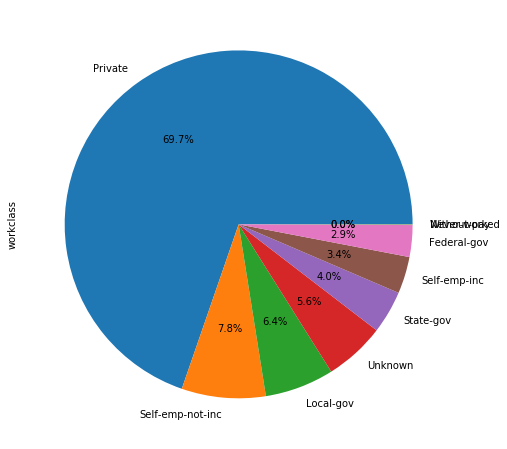
We see that 60% of people registered in the census work in the private sector. The rest is distribuited among between self-employement and public sector. We have a 5.6% of jobs that are unknown. Now we we’ll have a look at people earning more thatn 50,000$ depending on workclass.
plot_features_income(data=adult_income, column='workclass', type_names=workclass_types)
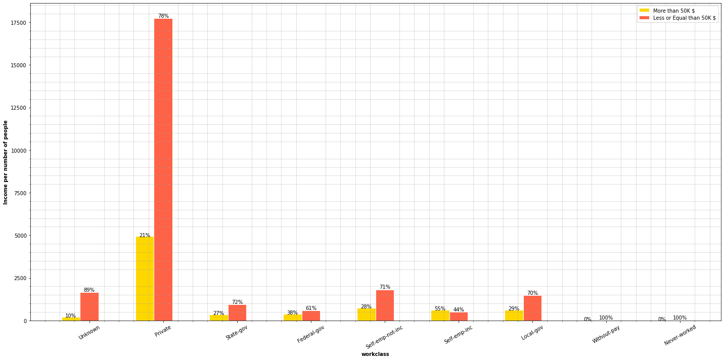
For every workclass, except self-employement, there are more people earning below 50,000$ than people earning above that amount.
Private sector holds most of the jobs, having the majority of them a salary below 50,000$. Now, let’s have a closer look at high paid and non-high paid jobs.
f,ax=plt.subplots(1,2,figsize=(18,8))
adult_income[adult_income['income'] == '>50K']['workclass'].value_counts().plot.pie(autopct='%1.1f%%', ax=ax[0])
ax[0].set_title(' More Than 50K $ per year according to workclass')
ax[0].set_ylabel('')
adult_income[adult_income['income'] == '<=50K']['workclass'].value_counts().plot.pie(autopct='%1.1f%%', ax=ax[1])
ax[1].set_title('Less or equal Than 50K $ per year according to workclass')
ax[1].set_ylabel('')
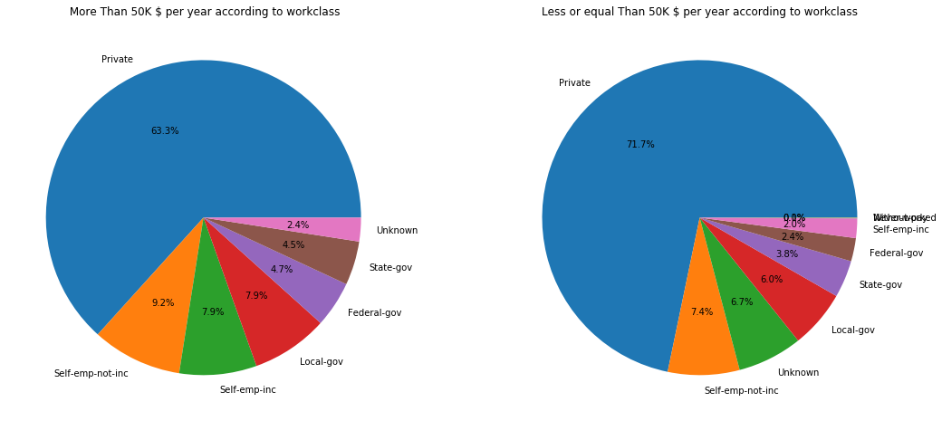
The observations in the high salary chart we draw is:
- 63.3% of high paid jobs can be found in the private sector.
- 17.1% are self employed jobs.
- 2.4% are Unknown jobs.
- The rest are Goverment or civil servant jobs.
The observations in the low salary chart we draw is:
- Most of the salaries under 50,000$ are in the private sector.
- The rest of percentages are similar to the ones in the high salary sector.
Education
Let’s have a look at the education people have in this dataset. As we did above with the work class, we will use a pieplot to see the distribution.
plt.figure(figsize=(10, 10))
adult_income['education'].value_counts().plot.pie(autopct='%1.1f%%')
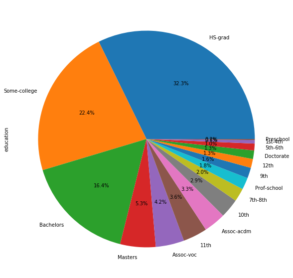
We see that people’s education scale in the census is very distributed.
plt.figure(figsize=(20, 10))
education_types = adult_income.education.unique()
plot_features_income(data=adult_income, column='education', type_names=education_types)
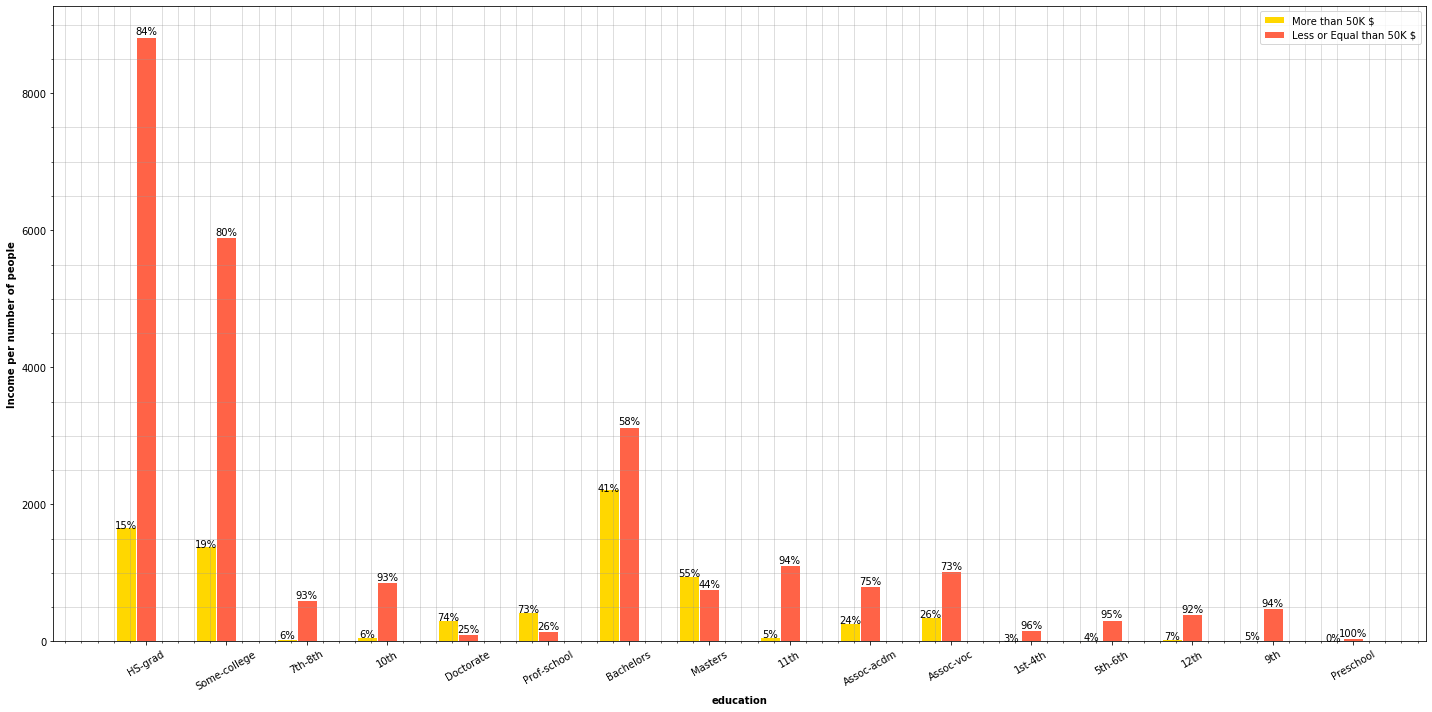
The charts plot some expectable information. We can see that most people who are school professors and most people holding a Master degree or a PhD earn more than 50,000$ per year. It’s interesting that the 41% of people owning a bachelor’s degree tend to earn more than 50,000$ a year. The observations we can draw here is that people who went to college and have professional degree tend to earn more than 50,000$ per year.
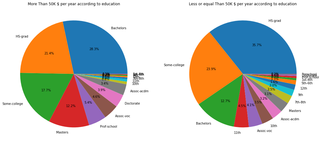
Now, if we look at the charts below, among people earning more than 50,000$ grouped by education we can see that half of the people have, at least, a college degree or are high school graduates (HS-grad). On the other hand, the other pie chart presents a similar distribuition but, as we saw in the previous charts, we can see that people earning a Master degree or a PhD tend to earn more than 50,000$.
f,ax=plt.subplots(1,2,figsize=(18,8))
adult_income[adult_income['income'] == '>50K']['education'].value_counts().plot.pie(autopct='%1.1f%%', ax=ax[0])
ax[0].set_title('More Than 50K $ per year according to education')
ax[0].set_ylabel('')
adult_income[adult_income['income'] == '<=50K']['education'].value_counts().plot.pie(autopct='%1.1f%%', ax=ax[1])
ax[1].set_title('Less or equal Than 50K $ per year according to education')
ax[1].set_ylabel('')
Marital status
Let’s see if marital status can have any correlation or impact on the income a person earns.
plt.figure(figsize=(10, 10))
adult_income['marital.status'].value_counts().plot.pie(autopct='%1.1f%%')
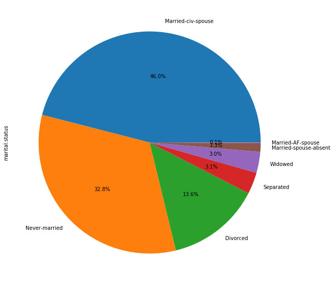
The 46% of the people in the census are married, the 32% is single and the 13.6% is divorced.
plt.figure(figsize=(20, 10))
marital_types = adult_income['marital.status'].unique()
plot_features_income(data=adult_income, column='marital.status', type_names=marital_types)
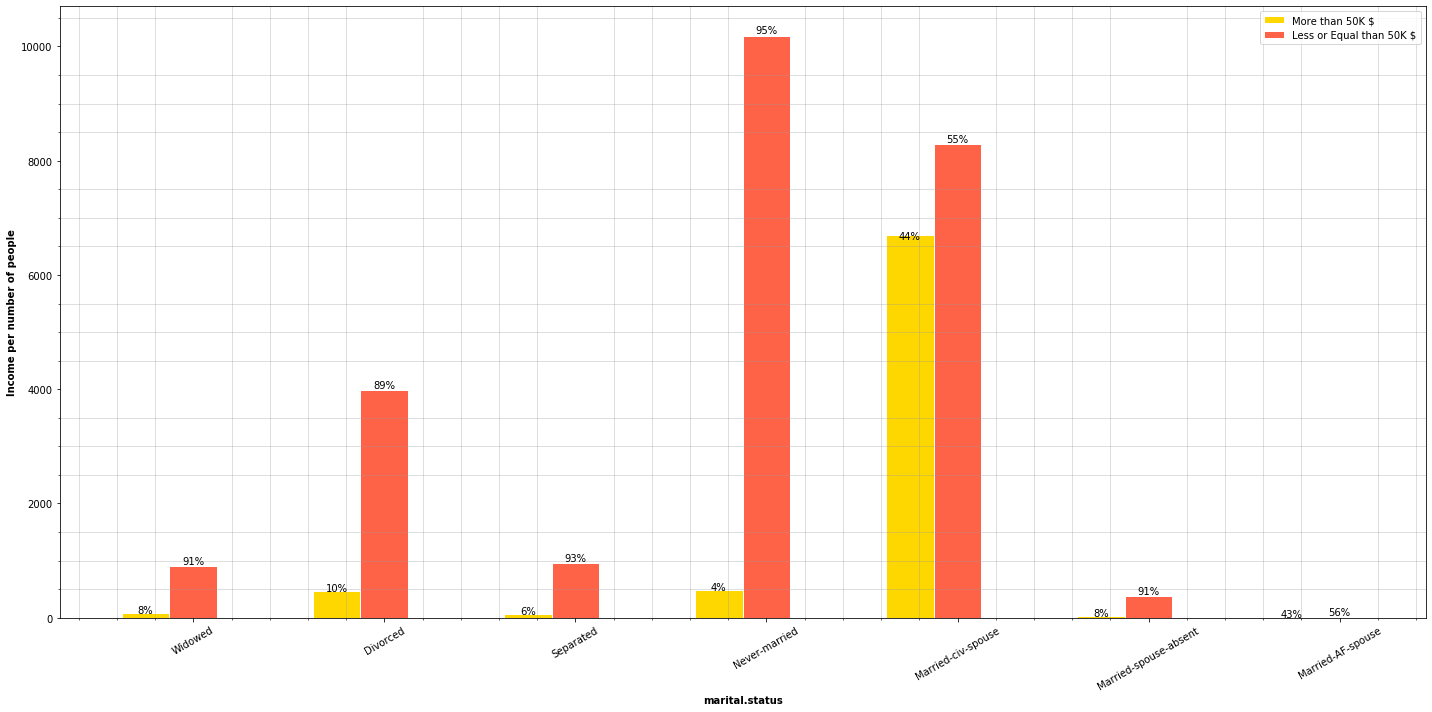
This is a very telling chart. As we can see, almost half of people who are married earn more than 50,000$, most people who are separated, divorced or single earn less than 50,000$. Now let’s separate the groups by people who earn more than 50,000$ and less than 50,000$.
f,ax=plt.subplots(1,2,figsize=(18,8))
adult_income[adult_income['income'] == '>50K']['marital.status'].value_counts().plot.pie(autopct='%1.1f%%', ax=ax[0])
ax[0].set_title('More Than 50K $ per year according to marital status')
ax[0].set_ylabel('')
adult_income[adult_income['income'] == '<=50K']['marital.status'].value_counts().plot.pie(autopct='%1.1f%%', ax=ax[1])
ax[1].set_title('Less or equal Than 50K $ per year according to marital status')
ax[1].set_ylabel('')
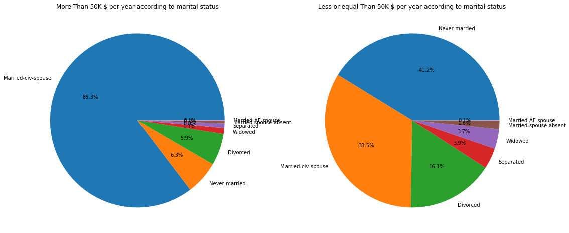
Most people earning more than 50,000$ are married in a 85%, while they only represent a 33.5% of people earning less than 50,000$. A very interesing fact is that people who earn less than 50,000$ are either single or divorced, in other words, don’t have partner.
occupation
We are taking a look at what kind of jobs have influence on salaries.
plt.figure(figsize=(8, 8))
adult_income['occupation'].value_counts().plot.pie(autopct='%1.1f%%')
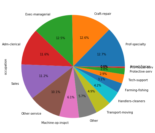
The occupation is pretty distributed in this dataset among the people who are registered in this dataste. Let’s see the incomes.
plt.figure(figsize=(20, 10))
occupation_types = adult_income['occupation'].unique()
plot_features_income(data=adult_income, column='occupation', type_names=occupation_types)
f,ax=plt.subplots(1,2,figsize=(18,8))
adult_income[adult_income['income'] == '>50K']['occupation'].value_counts().plot.pie(autopct='%1.1f%%', ax=ax[0])
ax[0].set_title('More Than 50K $ per year according to occupation fields')
ax[0].set_ylabel('')
adult_income[adult_income['income'] == '<=50K']['occupation'].value_counts().plot.pie(autopct='%1.1f%%', ax=ax[1])
ax[1].set_title('Less or equal Than 50K $ per year according to occupation fields')
ax[1].set_ylabel('')
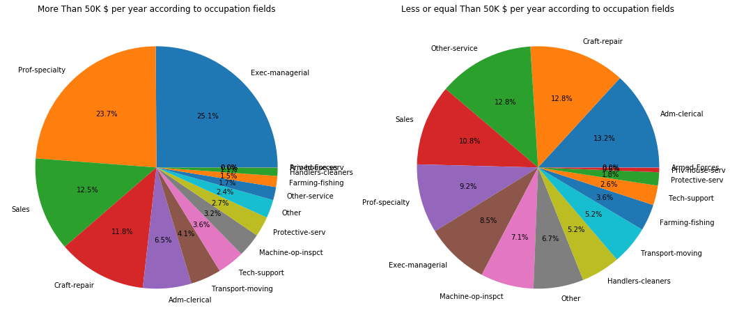
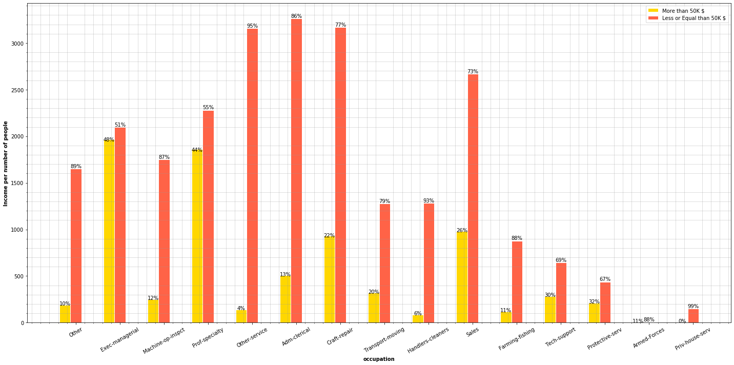
We can see that most well paid jobs are related to Executive Managers, specialized proffesors, techology engineers and protection services. The majority of the people having these jobs earn more than 50,000$ a year.
Relationship
plt.figure(figsize=(8, 8))
adult_income['relationship'].value_counts().plot.pie(autopct='%1.1f%%')
plt.ylabel('')
plt.figure(figsize=(20, 10))
relationships_types = adult_income['relationship'].unique()
plot_features_income(data=adult_income, column='relationship', type_names=relationships_types)
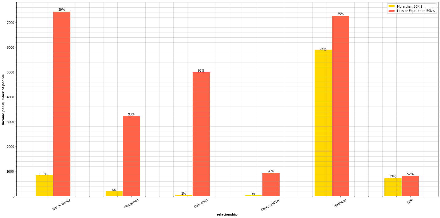
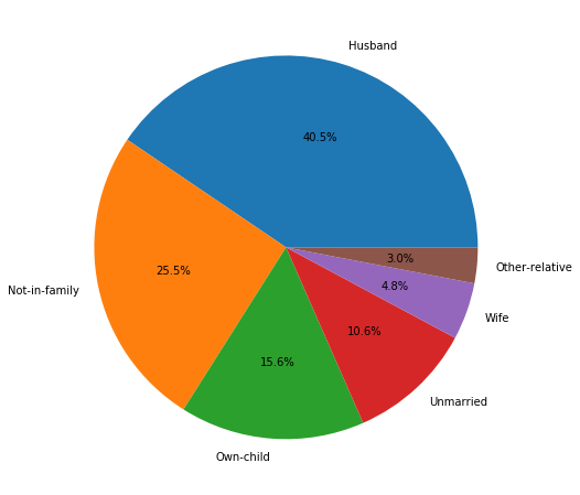
An interesting fact is that 44% of people earning more than 50,000$ are married men, but it’s even more interesting that the percentage of married women earning 50,000$ is slightly higher. Let’s divide the information by groups of people who earn more and less than 50,000$.
f,ax=plt.subplots(1,2,figsize=(18,8))
adult_income[adult_income['income'] == '>50K']['relationship'].value_counts().plot.pie(autopct='%1.1f%%', ax=ax[0])
ax[0].set_title('More Than 50K $ per year according to relationship status')
ax[0].set_ylabel('')
adult_income[adult_income['income'] == '<=50K']['relationship'].value_counts().plot.pie(autopct='%1.1f%%', ax=ax[1])
ax[1].set_title('Less or equal Than 50K $ per year according to relationship status')
ax[1].set_ylabel('')
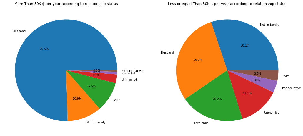
The pie charts show that, in general, most of people earning more than 50,000$ are married men. On the other pie charts the information is much more distribuited.
Race
plt.figure(figsize=(8, 8))
adult_income['race'].value_counts().plot.pie(autopct='%1.1f%%')
plt.ylabel('')
plt.figure(figsize=(20, 10))
race_types = adult_income['race'].unique()
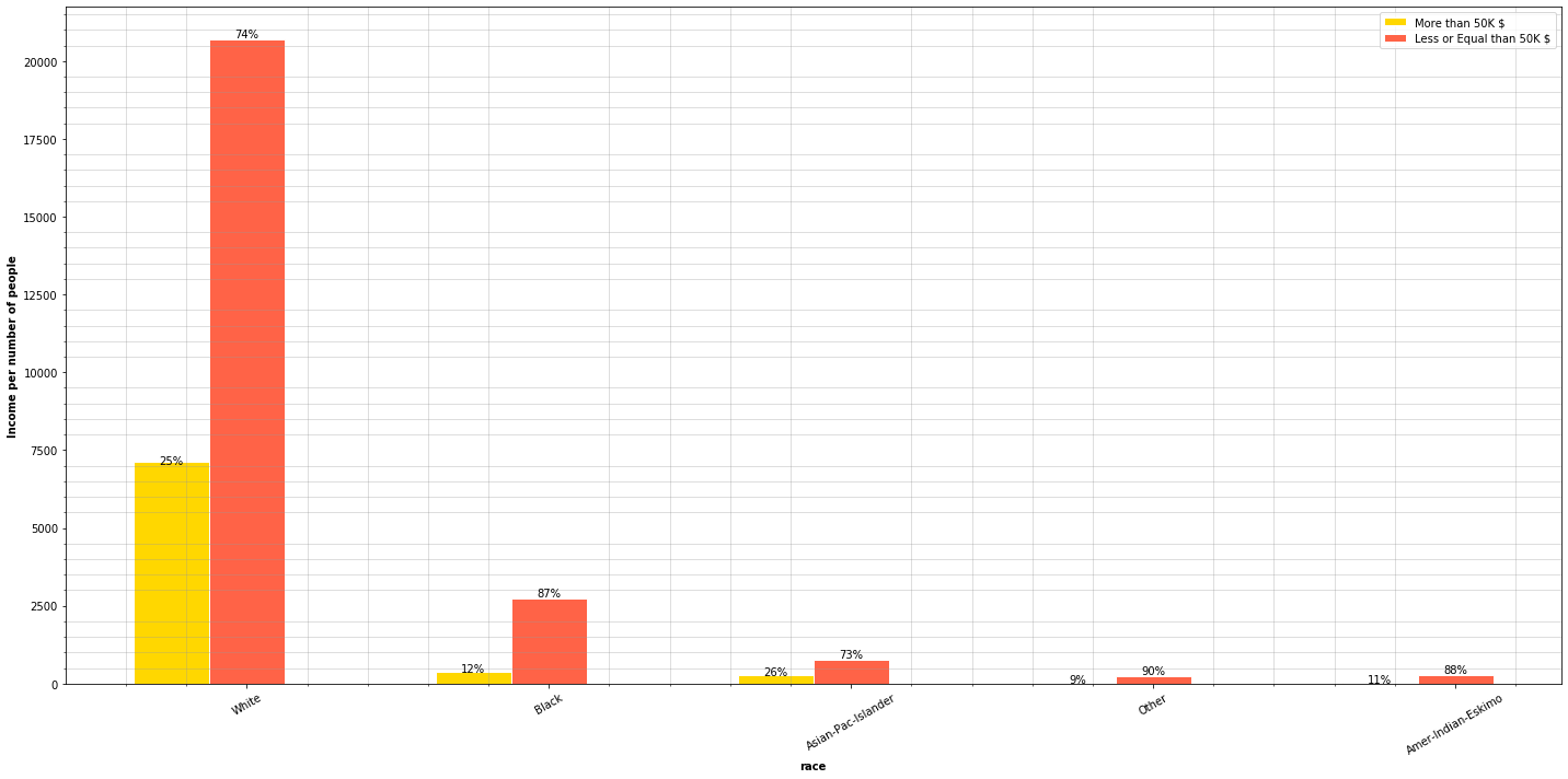
plot_features_income(data=adult_income, column='race', type_names=race_types)
f,ax=plt.subplots(1,2,figsize=(18,8))
adult_income[adult_income['income'] == '>50K']['race'].value_counts().plot.pie(autopct='%1.1f%%', ax=ax[0])
ax[0].set_title('More Than 50K $ per year according to race')
ax[0].set_ylabel('')
adult_income[adult_income['income'] == '<=50K']['race'].value_counts().plot.pie(autopct='%1.1f%%', ax=ax[1])
ax[1].set_title('Less or equal Than 50K $ per year according to race')
ax[1].set_ylabel('')
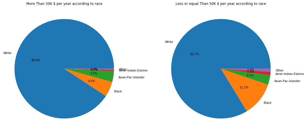
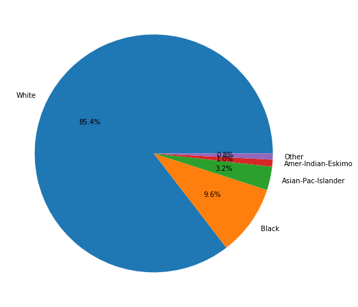
Statistically, there are more asians and whites earning more than 50,000$ than other races. Actually, according to the data we are managing, 90% of people earning are white when
Sex
Let’s see how gender can affect income.
plt.figure(figsize=(18, 8))
sns.countplot(adult_income['sex'], order = ['Male', 'Female'])
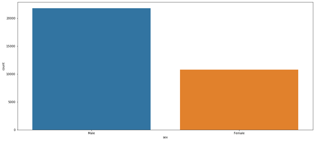
The census registers more men than women.
plt.figure(figsize=(20, 10))
race_types = adult_income['sex'].unique()
plot_features_income(data=adult_income, column='sex', type_names=race_types)
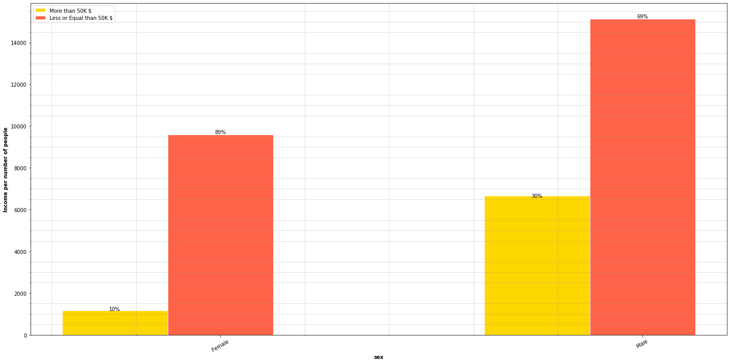
The chart show that 30% of men earn more than 50,000$ while only 10% of women surpass that amount. In other words, there are 200% more men than women earning above 50,000$.
Native Country
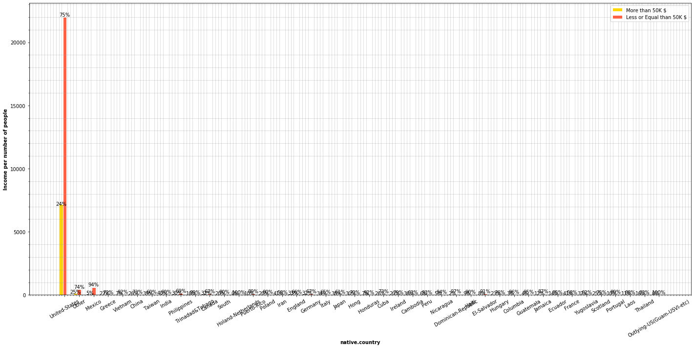
plt.figure(figsize=(20, 10))
country_types = adult_income['native.country'].unique()
plot_features_income(data=adult_income, column='native.country', type_names=country_types)
plt.figure(figsize=(20, 10))
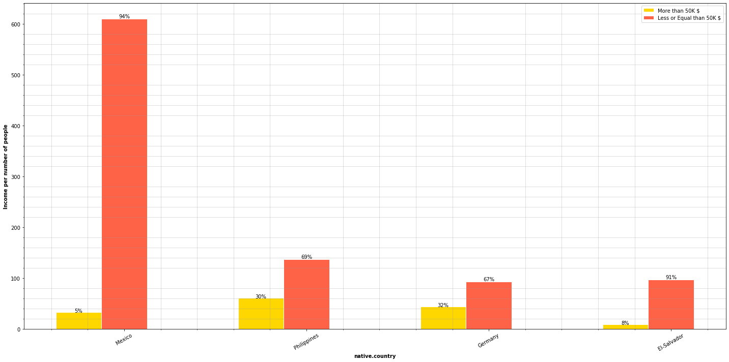
country_types = ['Mexico', 'Philippines', 'Germany', 'El-Salvador']
plot_features_income(data=adult_income, column='native.country', type_names=country_types)
f,ax=plt.subplots(1,2,figsize=(18,8))
adult_income[adult_income['income'] == '>50K']['native.country'].value_counts().plot.pie(autopct='', ax=ax[0])
ax[0].set_title('More Than 50K $ per year according to nationality')
ax[0].set_ylabel('')
adult_income[adult_income['income'] == '<=50K']['native.country'].value_counts().plot.pie(autopct='', ax=ax[1])
ax[1].set_title('Less or equal Than 50K $ per year according to nationality')
ax[1].set_ylabel('')
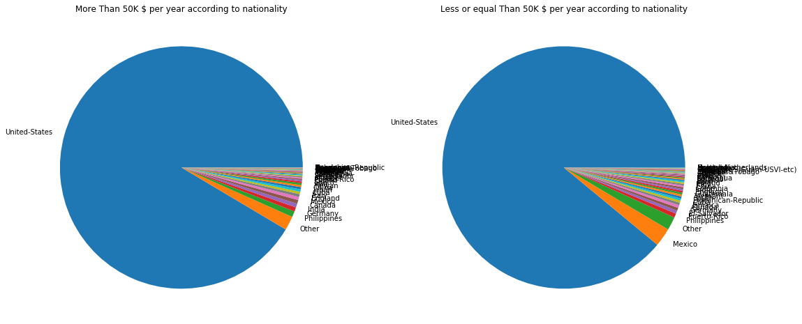
This really tells nothing, actually. Most of the people earning more than 50,000$ come from the US.
Numerical Analysis
Age
Now we’ll take a lot at the age distribuition of the census.
plt.figure(figsize=(20,10))
plt.grid()
sns.distplot(adult_income['age'])
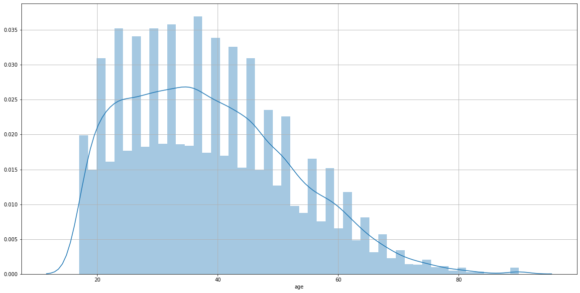
The age distribuition collected in the census is concentrated among from 20 y/o to the 50 y/o interval.
plt.figure(figsize=(20, 10))
plt.xticks(rotation=45)
sns.countplot(adult_income['age'], hue=adult_income['income'], palette=['dodgerblue', 'gold'])
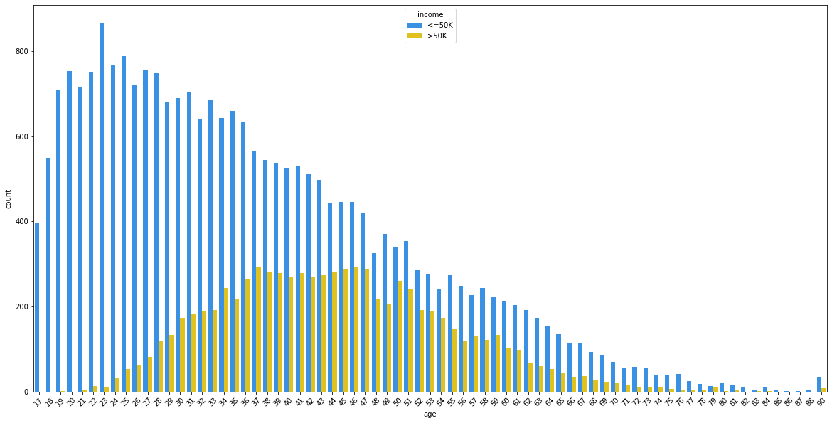
This is very a interesting plot. Most of young people don’t earn more than 50,000$ a yeat but as age grows, the percentages tend to balance. However, it seems that the gap tends to grow again as people turn over 50 years old.
Hours per week
plt.figure(figsize=(20,10))
plt.grid()
sns.distplot(adult_income['hours.per.week'])
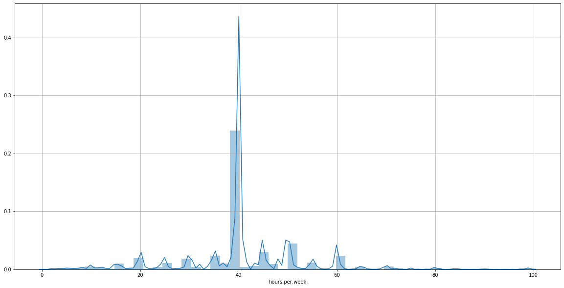
The plot shows that most people in the census work 40 hours per week. Now, we’d like to know the distribution of hours per week of the people earning more than 50,000$.
plt.figure(figsize=(20,10))
plt.grid()
sns.distplot(adult_income[adult_income['income']=='>50K']['hours.per.week'])
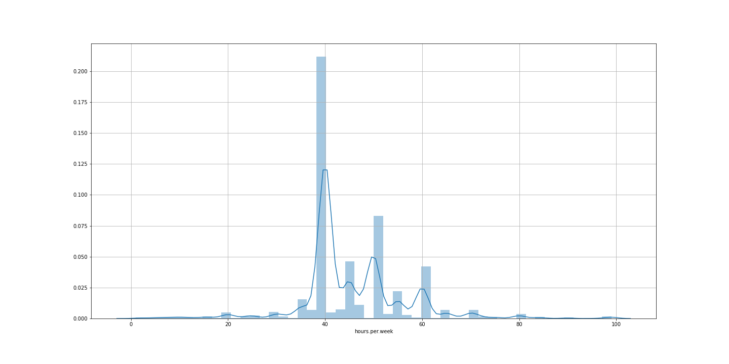
Normally, people who earn more than 50,000$ per year have a 40 hours/week rutine. There are also a lot working for 45, 50 and 60 hours/week.
Multivariable analysis
After analysing each variable, we will apply a multivariable analysis combining several variables and correlations.
correlations
numerical_dt = list(adult_income.select_dtypes(include=['float64', 'int64']).columns)
numerical_dt
['age',
 'fnlwgt',
 'education.num',
 'capital.gain',
 'capital.loss',
 'hours.per.week']
numerical_dt = np.asarray(numerical_dt)
numerical_dt
array(['age', 'fnlwgt', 'education.num', 'capital.gain', 'capital.loss',
       'hours.per.week'], dtype='<U14')
num_dt = adult_income.loc[:, numerical_dt]
num_dt = num_dt.drop(columns='education.num')
fig, ax = plt.subplots(figsize=(20,10))
sns.heatmap(num_dt.corr(method='pearson'), annot=True, fmt='.4f',
            cmap=plt.get_cmap('coolwarm'), cbar=False, ax=ax)
ax.set_yticklabels(ax.get_yticklabels(), rotation="horizontal")
plt.savefig('./correlations.png', bbox_inches='tight', pad_inches=0.0)
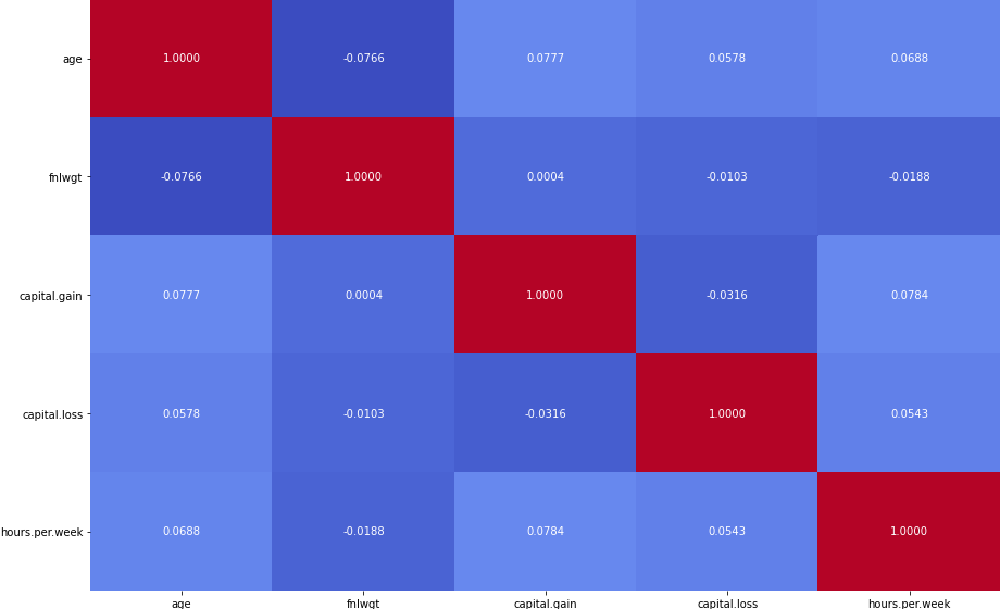
The heatmap shows no evident high correlation cases among the numerical variables.
Analysis based on gender and age
After analyzing each of every feature we realized men to earn more than women, so we decided execute a better analysis on this field, so that we can draw some useful informations.
Gender and workclass
We’re going to have a look at the relations between gender and workclass and occupations, and what kind of jobs women mostly occupy in the census.
fig, axs = plt.subplots(1, 2, figsize=(20, 10))
plt.figure(figsize=(20, 10))
sns.countplot(adult_income['workclass'], hue=adult_income['sex'], ax=axs[1], palette=['pink', 'dodgerblue'], order=adult_income[adult_income['sex'] == 'Female']['workclass'].value_counts().index)
sns.countplot(adult_income['occupation'], hue=adult_income['sex'], ax=axs[0], palette=['pink', 'dodgerblue'], order=adult_income[adult_income['sex'] == 'Female']['occupation'].value_counts().index)
plt.setp(axs[0].xaxis.get_majorticklabels(), rotation=45)
plt.setp(axs[1].xaxis.get_majorticklabels(), rotation=45)
plt.show()
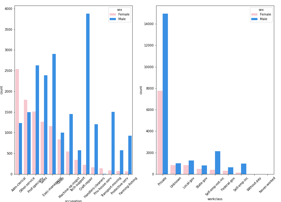
Most women occupy the jobs related to clerical administration, cleaning services and other services, but jobs related to professor speciality, business and sales, engineering, technology, transport, protection service and primary sector are mostly occupied by men. It’s also interesting to see that most gender gap in private sector and self employement is bigger than in other sectors.
Gender, Hours per week and Income
Let’s see if there’s any relationship between hours per week and income divided by gender.
fig, ax = plt.subplots(1, 2, figsize=(25, 8))
plt.xticks(rotation=45)
sns.violinplot(adult_income['sex'], adult_income['hours.per.week'], hue=adult_income['income'], palette=['gold', 'dodgerblue'], ax=ax[0])
sns.stripplot(adult_income['sex'], adult_income['hours.per.week'], hue=adult_income['income'], palette=['skyblue', 'tomato'], ax=ax[1])
ax[0].grid(True)
ax[1].grid(True)
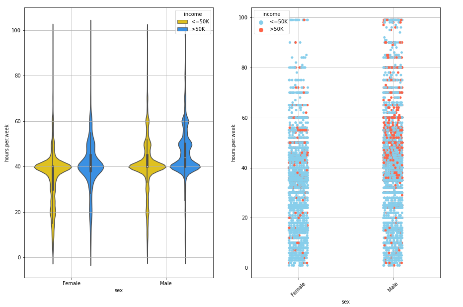
The charts show that men work for more hours than women. The left chart shows that, regardless of the income, there are more women working for less hours than men and the men chart is more distribuited wheh it is above 40 hours per week. The right chart shows that men working for more hours tend to earn more than 50,000$. We can see a concentration of red dots among the 40 and 60 hours/week interval. On the other hand, this concentration doesn’t appear on women side. Even though the hours per week gap between men and women is not so big, it’s clear that there’s no correlation between hours per week and income when it comes to women.
Age, gender and Hours per week
fig, ax = plt.subplots(1, 2, figsize=(30, 8))
plt.xticks(rotation=45)
sns.lineplot(adult_income['age'], adult_income['hours.per.week'], hue=adult_income['income'], palette=['tomato', 'dodgerblue'], ax=ax[0])
sns.lineplot(adult_income['age'], adult_income['hours.per.week'], hue=adult_income['sex'], palette=['tomato', 'dodgerblue'], ax=ax[1])
ax[0].grid(True)
ax[0].title.set_text("Age and Hours per week divided by Income")
ax[1].grid(True)
ax[0].title.set_text("Age and Hours per week divided by Gender")
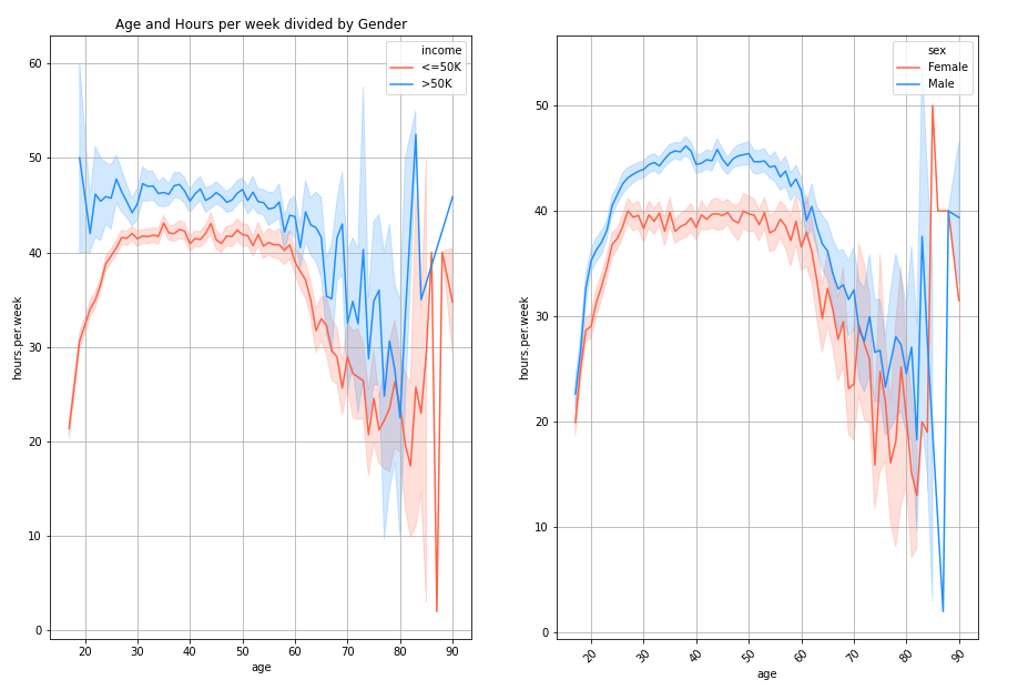
We see a very interesting trend in chart above. Let’s take a look at the left chart first. As the age grows, there are more people earning more than 50,000$ but work for more hours. In both cases, as age reaches the 60 year old, people tend to work for less hours but the number of people earning more than 50K increases. What’s funny is that people who earn a lot start working for more hours when as they start turning 80.
The chart on the right shows very similar line paths. Men tend work for more hours than women, but as they get closer the standard retirement age, men and women work for the similar number of hours. What’s very bizare, is that women who are 80 and 90 are the one working for more hours than the rest of ages.
Final observations and Conclusion after the Data Exploration
We analyzed and explored all the features of the dataset and their particularities, we want to summerise all the interesting facts we discovered and could help us predict whether a person earns more or less than 50,000$. The interesting observations we drew are:
- Workclas and occupations
- The 55% of self employed people work are self-employed
- The 63.3% of the total people in the census earning more than 50,000$ work in the private sector and the 71% of the total people in the census earning under 50,000$ work in the private sector too.
- If we only focus on the private sector, the 26% of the people earn more than 50,000$\year.
- Jobs in which people earn above 50,000$ are executive managers, protection services, college professors, engineering and jobs related to technology who are mostly occupied by men.
- Education
- It’s interesting that the 73% of the Professors, 74% of PhDs, the 55% of people owning a Master Degree and the 40% of Bachelors bachelors earn above 50,000 $.
- We this information we can conclude that owning at least a college degree will increase your probabilities to earn 50,000 $/year.
- Gender, Marital Status and relationship
- The 85% of total people in the census earning more than 50,000$ are married.
- The 44% of people who are married earn more than 50,000$.
- The 44% of husbands earen more than 50,000$.
- The 47% of Wifes earn more than 50,000$.
- According to this info, being maried increases the probability of earning above 50,000$.
- Other interesting information
- The salary is directly related to age. The older people get, the more the surpass the 50,000$ line.
- Men work for more hours than women in all ages but as they both get closer to the 60’s they tend to work for similiar amount of hours per week.
- People earning more than 50,000$ per year tend to work for more hours too.
- Men working for more than 40 hours per week tend to earn above 50,000$ but women don’t follow this trend and there’s no correlation between hours per week and income when it comes to females.
Conclusions
With the information above we’ve seen, we could say that a person who’s likely to earn above 50.000$/year is a person who:
- Is male whose age is between 30 or over.
- Married
- Whose job is related to bussines, engineering, college profesor, protection services, technical or IT field.
- Holds a master degree or a Phd.
- Works for more than 40 hours per week.
- Is American, Asian or European.
Data Cleaning and Formatting
Now that we’ve performed out data exploration and have drawn some assumptions, it’s time to clean the data, format it and erase those rows and columns who are useless or could noise during our learning process.
adult_income_prep = adult_income.copy()
Outliers anomaly
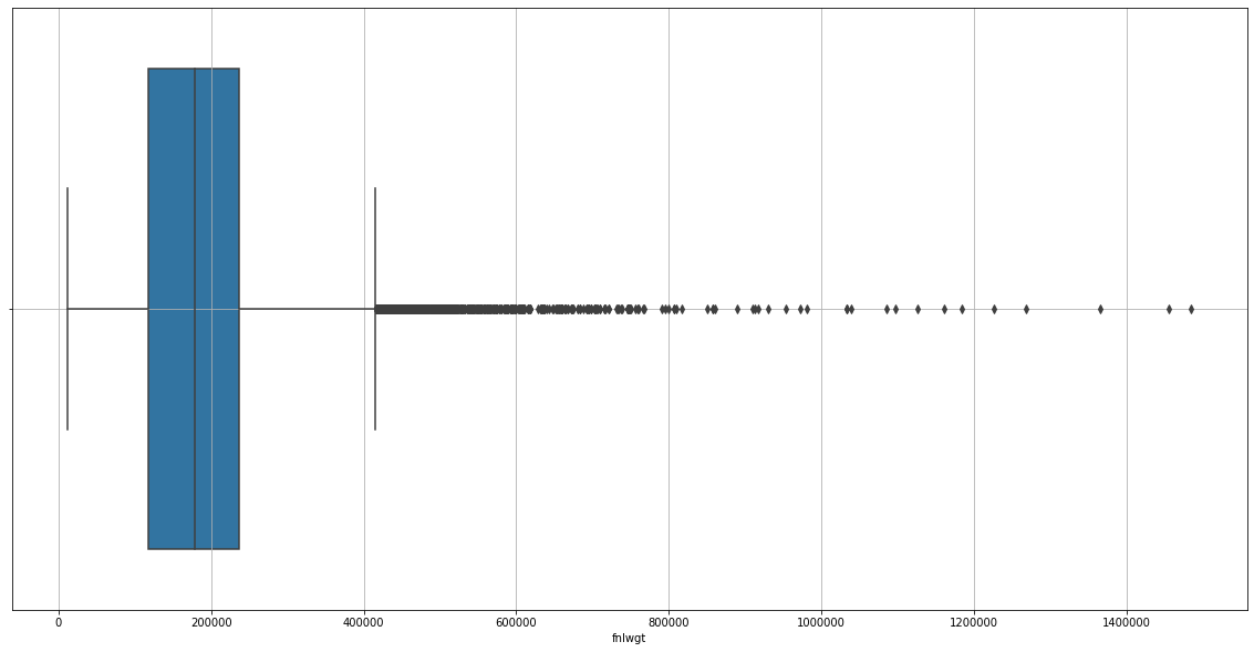
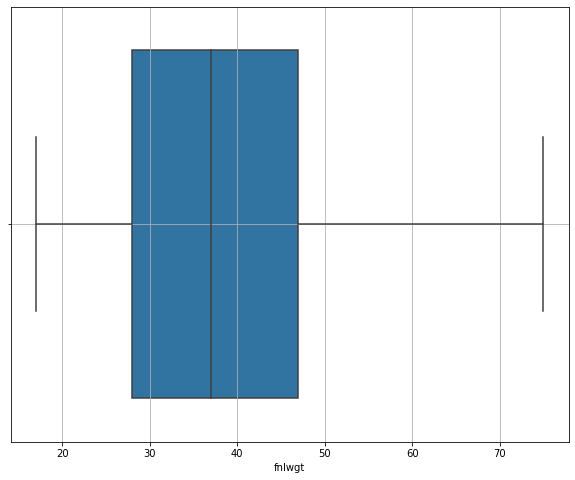
Outliers can be very harmful for our learning models and can cause noise that can create distorsions in our predictions. We’ll create an auxiliar function to erase the outliers in each numerical feature.
def treat_outliers(data, column, upper=False, lower=False):
    Q1=adult_income_prep[column].quantile(0.25)
    Q3=adult_income_prep[column].quantile(0.75)
    IQR=Q3-Q1
    print(Q1)
    print(Q3)
    print(IQR)
    U_threshold = Q3+1.5*IQR
    #print(L_threshold, U_threshold)
    if upper:
        adult_income_prep[column] = adult_income_prep[adult_income_prep[column] < U_threshold]
    if lower:
        adult_income_prep[column] = adult_income_prep[adult_income_prep[column] >= U_threshold]
Checking outliers in the age feature
plt.figure(figsize=(20,10))
sns.boxplot(data=adult_income_prep, x=adult_income_prep['age'])
plt.grid()
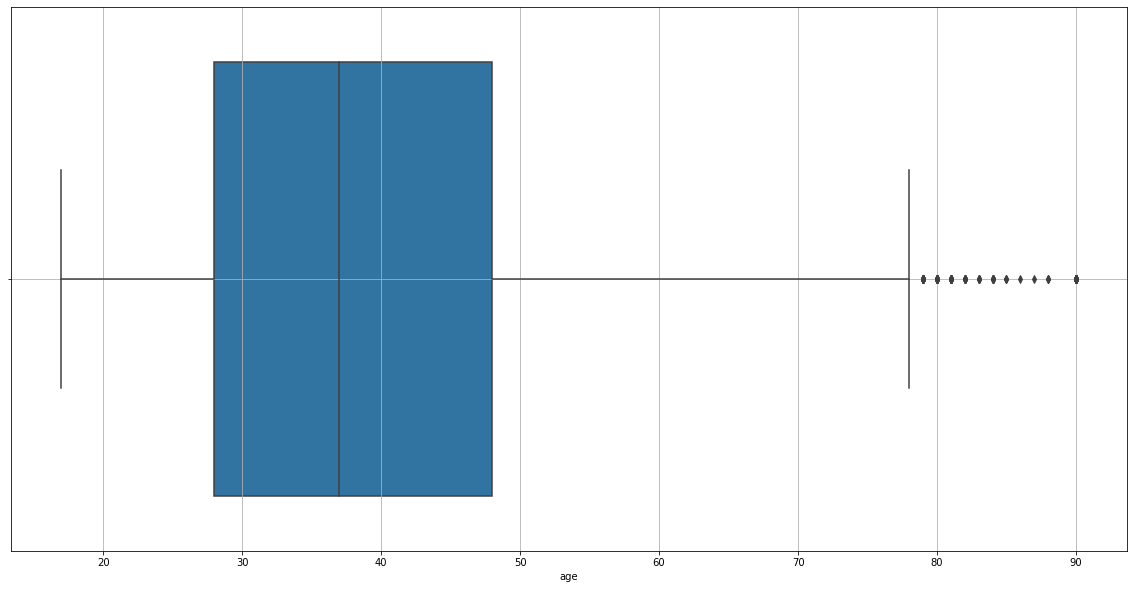
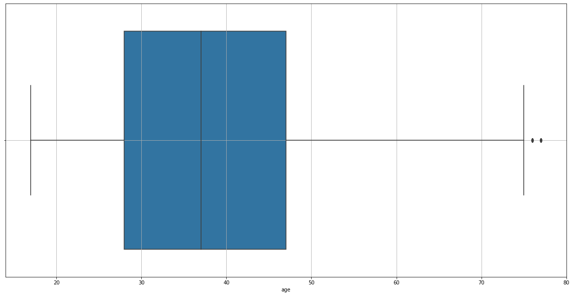
We found outliers in our chart, so we’ll erase them.
treat_outliers(data=adult_income_prep, column='age', upper=True)
28.0
48.0
20.0
plt.figure(figsize=(20,10))
sns.boxplot(data=adult_income_prep, x=adult_income_prep['age'])
plt.grid()
treat_outliers(data=adult_income_prep, column='age', upper=True)
28.0
47.0
19.0
Let’s check out now
plt.figure(figsize=(20,10))
sns.boxplot(data=adult_income_prep, x=adult_income_prep['age'])
plt.grid()

There are still to rows which age column contains an outlier.
treat_outliers(data=adult_income_prep, column='age', upper=True)
28.0
47.0
19.0
plt.figure(figsize=(20,10))
sns.boxplot(data=adult_income_prep, x=adult_income_prep['age'])
plt.grid()
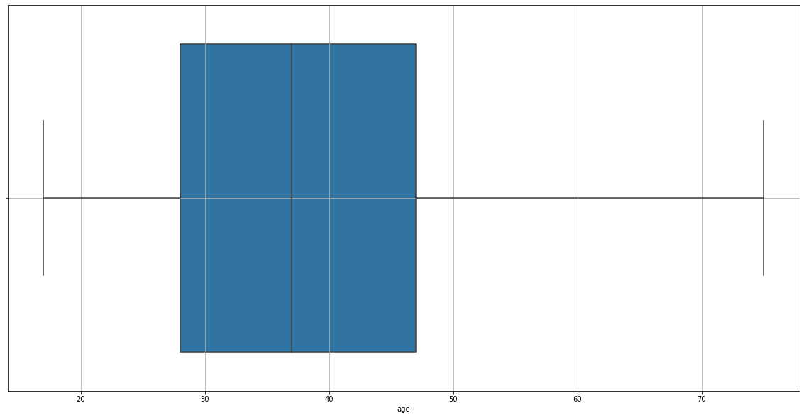
Now it’s OK.
Removing outliers of final Weight
plt.figure(figsize=(20,10))
sns.boxplot(data=adult_income_prep, x=adult_income_prep['fnlwgt'])
plt.grid()
treat_outliers(data=adult_income_prep, column='fnlwgt', upper=True)
117827.0
237051.0
119224.0
plt.figure(figsize=(10,8))
sns.boxplot(data=adult_income_prep, x=adult_income_prep['fnlwgt'])
plt.grid()
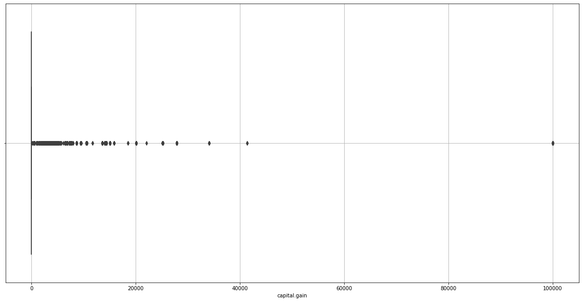
Checking outliers in Capital Gain and Loss
plt.figure(figsize=(20,10))
sns.boxplot(data=adult_income_prep, x=adult_income_prep['capital.gain'])
plt.grid()
plt.figure(figsize=(20,10))
sns.boxplot(data=adult_income_prep, x=adult_income_prep['capital.loss'])
plt.grid()
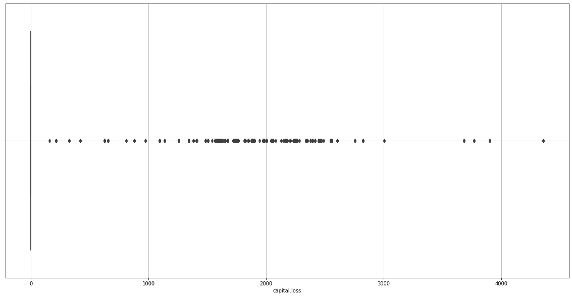
We realize capital.gain and capital.loss will disturb our learning process as they don’t give any useful information either.
adult_income_prep = adult_income_prep.drop(columns=['capital.gain', 'capital.loss'])
Checking outliers of Hours per week
plt.figure(figsize=(20,10))
sns.boxplot(data=adult_income_prep, x=adult_income_prep['hours.per.week'])
plt.grid()
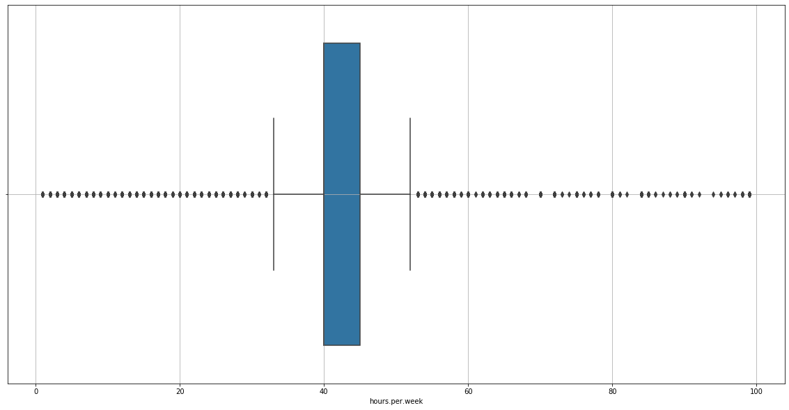
There are outliers, we must remove them.
treat_outliers(data=adult_income_prep, column='hours.per.week', upper=True, lower=True)
40.0
45.0
5.0
plt.figure(figsize=(20,10))
sns.boxplot(data=adult_income_prep, x=adult_income_prep['hours.per.week'])
plt.grid()
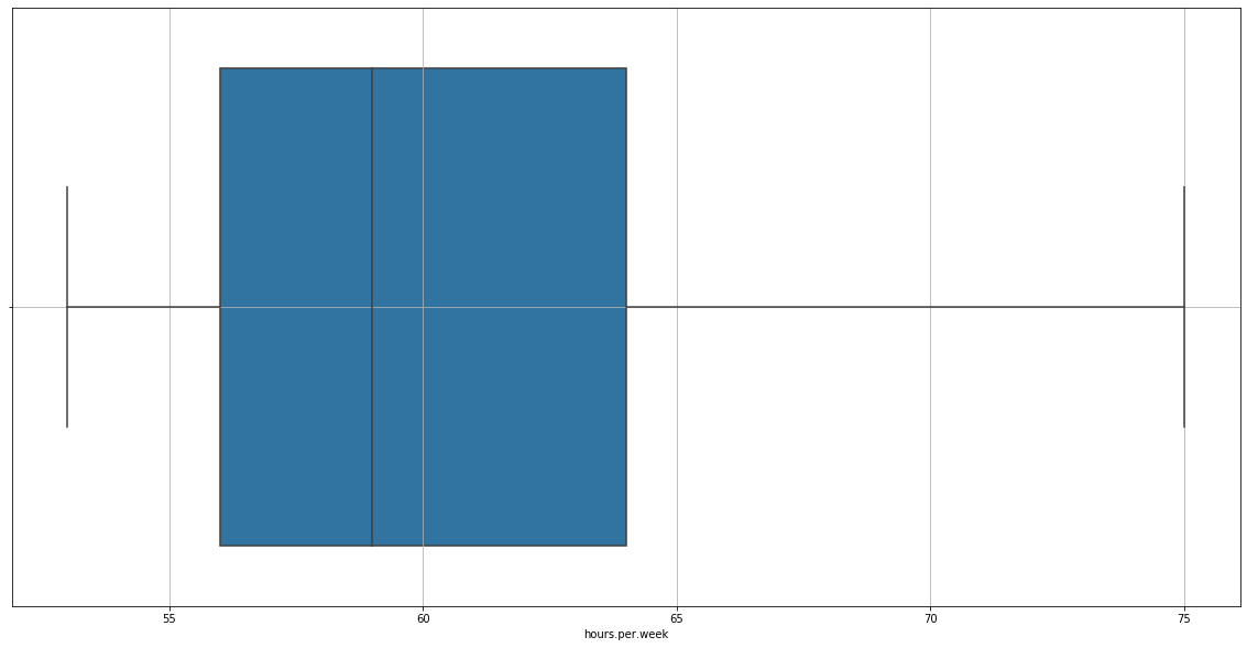
Now it’s alright. Let’s see how our dataset is now.
adult_income_prep.head()
We found new null values in the age and fnlwgt column. We have to fill it the median value.
from sklearn.impute import SimpleImputer
imputer = SimpleImputer(strategy="median")
adult_income_num = adult_income_prep[['age', 'fnlwgt', 'hours.per.week']]
adult_income_num.head()
| age | fnlwgt | hours.per.week | |
|---|---|---|---|
| 0 | NaN | NaN | NaN |
| 1 | NaN | NaN | NaN |
| 2 | 66 | 66 | 66 |
| 3 | 54 | 54 | 54 |
| 4 | 41 | 41 | NaN |
imputer.fit(adult_income_num)
SimpleImputer(add_indicator=False, copy=True, fill_value=None,
              missing_values=nan, strategy='median', verbose=0)
imputer.statistics_
array([37., 37., 59.])
X = imputer.transform(adult_income_num)
X
array([[37., 37., 59.],
       [37., 37., 59.],
       [66., 66., 66.],
       ...,
       [40., 40., 59.],
       [58., 58., 58.],
       [22., 22., 59.]])
adult_tr = pd.DataFrame(X, columns=adult_income_num.columns)
adult_tr
| age | fnlwgt | hours.per.week | |
|---|---|---|---|
| 0 | 37.0 | 37.0 | 59.0 |
| 1 | 37.0 | 37.0 | 59.0 |
| 2 | 66.0 | 66.0 | 66.0 |
| 3 | 54.0 | 54.0 | 54.0 |
| 4 | 41.0 | 41.0 | 59.0 |
| ... | ... | ... | ... |
| 32556 | 22.0 | 22.0 | 59.0 |
| 32557 | 27.0 | 27.0 | 59.0 |
| 32558 | 40.0 | 40.0 | 59.0 |
| 32559 | 58.0 | 58.0 | 58.0 |
| 32560 | 22.0 | 22.0 | 59.0 |
32561 rows × 3 columns
adult_income_prep['age'] = adult_tr['age']
adult_income_prep['fnlwgt'] = adult_tr['fnlwgt']
adult_income_prep['hours.per.week'] = adult_tr['hours.per.week']
Alright, no null values now. Now let’s change the income values by 1 and 0.
adult_income_prep['income'] = adult_income_prep['income'].replace('<=50K', 0)
adult_income_prep['income'] = adult_income_prep['income'].replace('>50K', 1)
We’ll erase the education feature because it’s the same as education.num.
adult_income_prep = adult_income_prep.drop(columns='education')
Category Encoding
During our learning process, we can use non-numerical values, so it’s better to encode our non-numerical features.
adult_income_prep.workclass = adult_income_prep.workclass.astype('category').cat.codes
adult_income_prep['marital.status'] = adult_income_prep['marital.status'].astype('category').cat.codes
adult_income_prep['occupation'] = adult_income_prep['occupation'].astype('category').cat.codes
adult_income_prep['relationship'] = adult_income_prep['relationship'].astype('category').cat.codes
adult_income_prep['race'] = adult_income_prep['race'].astype('category').cat.codes
adult_income_prep['sex'] = adult_income_prep['sex'].astype('category').cat.codes
adult_income_prep['native.country'] = adult_income_prep['native.country'].astype('category').cat.codes
Now our dataset is ready for training. If you want to have a quick look at the dataset, you can type this:
adult_income_prep.head()
Training and Comparing models
np.random.seed(1234)
We prepare out dataset and divide it into subsets.
y = adult_income_prep['income']
X_prepared = adult_income_prep.drop(columns='income')
We import the sklearn library we need to partition the dataset into training and testing subsets.
from sklearn.model_selection import train_test_split
train_X, val_X, train_y, val_y = train_test_split(X_prepared, y, random_state = 0)
We will use a crossvalidation to search for the best hyperparameters.
from sklearn.model_selection import cross_val_score
We’ll have to dictionaries containing the Mean Absolute Error and the accuracy value of each algorithm.
MAE = dict()
Acc = dict()
Traditional ML Techniques: Logistic regression
We will perform a crossvalidated logistic regression to our dataset. From the Logistic Regression we will extract the coeficients/features who have a better or a worse influence on the prediction.
from sklearn.linear_model import LogisticRegression
log_model = LogisticRegression()
score = cross_val_score(log_model, X_prepared, y, scoring="neg_mean_absolute_error", cv=10)
print("MAE score mean:\n", np.abs(score).mean())
MAE score mean:
 0.1939743749806691
from sklearn.model_selection import GridSearchCV
param_grid = [
    {'C': [0.001,0.01,0.1,1,10,100]},
]
grid_search = GridSearchCV(log_model, param_grid, cv=5, scoring='neg_mean_squared_error')
grid_search.fit(train_X, train_y)
GridSearchCV(cv=5, error_score=nan,
             estimator=LogisticRegression(C=1.0, class_weight=None, dual=False,
                                          fit_intercept=True,
                                          intercept_scaling=1, l1_ratio=None,
                                          max_iter=100, multi_class='auto',
                                          n_jobs=None, penalty='l2',
                                          random_state=None, solver='lbfgs',
                                          tol=0.0001, verbose=0,
                                          warm_start=False),
             iid='deprecated', n_jobs=None,
             param_grid=[{'C': [0.001, 0.01, 0.1, 1, 10, 100]}],
             pre_dispatch='2*n_jobs', refit=True, return_train_score=False,
             scoring='neg_mean_squared_error', verbose=0)
grid_search.best_params_
{'C': 100}
log_model = LogisticRegression(C=100, random_state=0)
log_model.fit(train_X, train_y)
LogisticRegression(C=100, class_weight=None, dual=False, fit_intercept=True,
                   intercept_scaling=1, l1_ratio=None, max_iter=100,
                   multi_class='auto', n_jobs=None, penalty='l2',
                   random_state=0, solver='lbfgs', tol=0.0001, verbose=0,
                   warm_start=False)
val_predictions = log_model.predict(val_X)
columns = adult_income_prep.drop(columns='income').columns
coefs = log_model.coef_[0]
print("Features - Coefs")
for index in range(len(coefs)):
    print(columns[index], ":", coefs[index])
Features - Coefs
age : 0.0591988304177485
workclass : -0.09002223884698841
fnlwgt : -0.014278177489885961
education.num : 0.37357447044203884
marital.status : -0.21856029678303646
occupation : -7.447641781696112e-05
relationship : -0.14266599757140028
race : 0.13047846851261513
sex : 1.0391318172666453
hours.per.week : -0.12302044432859731
native.country : 0.001667892121472329
It’s pretty interesting to see what the logistic regression reveals.
- Education, relationship, gender and race are the features which most positively have an impact on income
- The hours per week and the final weight have a negative impact on income
Now, let’s calculate the mean absolute error (MAE).
from sklearn.metrics import mean_absolute_error
lm_mae = mean_absolute_error(val_y, val_predictions)
from sklearn.metrics import accuracy_score
lm_acc = accuracy_score(val_y, val_predictions)
MAE['lm'] = lm_mae
Acc['lm'] = lm_acc
print("The mae is", lm_mae)
The mae is 0.19395651639847686
print("The accuracy is", lm_acc * 100, "%")
The accuracy is 80.60 %
Modern ML techniques
We’ve performed a training and testing process using a traditional ML technique which was the Logistic Regression. Now, we’ll use some modern classifers which are:
- Random Forests
- K Nearest Neighbours
- Gradient Boosting Machine
- Naive Bayes
For all of them we’ll perform a crossvaliation to detect the best hyperparameters.
Random Forests
from sklearn.ensemble import RandomForestClassifier
param_grid = [
    {'n_estimators': [3, 10, 30], 'max_features': [2, 4, 6, 8]},
    {'bootstrap': [False], 'n_estimators': [3, 10], 'max_features': [2, 3, 4]}
]

forest_model = RandomForestClassifier()
grid_search = GridSearchCV(forest_model, param_grid, cv=5, scoring='neg_mean_squared_error')
grid_search.fit(train_X, train_y)
GridSearchCV(cv=5, error_score=nan,
             estimator=RandomForestClassifier(bootstrap=True, ccp_alpha=0.0,
                                              class_weight=None,
                                              criterion='gini', max_depth=None,
                                              max_features='auto',
                                              max_leaf_nodes=None,
                                              max_samples=None,
                                              min_impurity_decrease=0.0,
                                              min_impurity_split=None,
                                              min_samples_leaf=1,
                                              min_samples_split=2,
                                              min_weight_fraction_leaf=0.0,
                                              n_estimators=100, n_jobs=None,
                                              oob_score=False,
                                              random_state=None, verbose=0,
                                              warm_start=False),
             iid='deprecated', n_jobs=None,
             param_grid=[{'max_features': [2, 4, 6, 8],
                          'n_estimators': [3, 10, 30]},
                         {'bootstrap': [False], 'max_features': [2, 3, 4],
                          'n_estimators': [3, 10]}],
             pre_dispatch='2*n_jobs', refit=True, return_train_score=False,
             scoring='neg_mean_squared_error', verbose=0)
grid_search.best_params_
{'max_features': 2, 'n_estimators': 30}
rf_model = RandomForestClassifier(max_features=2, n_estimators=30, random_state=0)
rf_model.fit(train_X, train_y)
RandomForestClassifier(bootstrap=True, ccp_alpha=0.0, class_weight=None,
                       criterion='gini', max_depth=None, max_features=2,
                       max_leaf_nodes=None, max_samples=None,
                       min_impurity_decrease=0.0, min_impurity_split=None,
                       min_samples_leaf=1, min_samples_split=2,
                       min_weight_fraction_leaf=0.0, n_estimators=30,
                       n_jobs=None, oob_score=False, random_state=0, verbose=0,
                       warm_start=False)
val_predictions = rf_model.predict(val_X)
rf_mae = mean_absolute_error(val_y, val_predictions)
rf_mae
0.18634074438029727
rf_acc = accuracy_score(val_y, val_predictions)
rf_acc
0.8136592556197028
MAE['rf'] = rf_mae
Acc['rf'] = rf_acc
Gradient Boosting Machine
from sklearn.ensemble import GradientBoostingClassifier
gbm_model = GradientBoostingClassifier(learning_rate=0.1, n_estimators=60, max_features='sqrt', subsample=0.8, random_state=0)

param_grid = {'max_depth':range(5,16,2), 'min_samples_split':range(200,1001,200)}

grid_search = GridSearchCV(gbm_model, param_grid, cv=5, scoring='neg_mean_squared_error')
grid_search.fit(train_X, train_y)
GridSearchCV(cv=5, error_score=nan,
             estimator=GradientBoostingClassifier(ccp_alpha=0.0,
                                                  criterion='friedman_mse',
                                                  init=None, learning_rate=0.1,
                                                  loss='deviance', max_depth=3,
                                                  max_features='sqrt',
                                                  max_leaf_nodes=None,
                                                  min_impurity_decrease=0.0,
                                                  min_impurity_split=None,
                                                  min_samples_leaf=1,
                                                  min_samples_split=2,
                                                  min_weight_fraction_leaf=0.0,
                                                  n_estimators=60,
                                                  n_iter_no_change=None,
                                                  presort='deprecated',
                                                  random_state=0, subsample=0.8,
                                                  tol=0.0001,
                                                  validation_fraction=0.1,
                                                  verbose=0, warm_start=False),
             iid='deprecated', n_jobs=None,
             param_grid={'max_depth': range(5, 16, 2),
                         'min_samples_split': range(200, 1001, 200)},
             pre_dispatch='2*n_jobs', refit=True, return_train_score=False,
             scoring='neg_mean_squared_error', verbose=0)
grid_search.best_params_
{'max_depth': 7, 'min_samples_split': 800}
gbm_model = GradientBoostingClassifier(max_depth=7, min_samples_split=800, random_state=0)
gbm_mae = mean_absolute_error(val_y, val_predictions)
gbm_mae
0.18634074438029727
gbm_acc = accuracy_score(val_y, val_predictions)
gbm_acc
0.8136592556197028
MAE['gbm'] = gbm_mae
Acc['gbm'] = gbm_acc
K-Nearest Neighbours
from sklearn.neighbors import KNeighborsClassifier as KNN
KNN
sklearn.neighbors._classification.KNeighborsClassifier
knn_model = KNN()

param_grid = {'n_neighbors':range(5,10,1)}

grid_search = GridSearchCV(knn_model, param_grid, cv=5, scoring='neg_mean_squared_error')

grid_search.fit(train_X, train_y)
GridSearchCV(cv=5, error_score=nan,
             estimator=KNeighborsClassifier(algorithm='auto', leaf_size=30,
                                            metric='minkowski',
                                            metric_params=None, n_jobs=None,
                                            n_neighbors=5, p=2,
                                            weights='uniform'),
             iid='deprecated', n_jobs=None,
             param_grid={'n_neighbors': range(5, 10)}, pre_dispatch='2*n_jobs',
             refit=True, return_train_score=False,
             scoring='neg_mean_squared_error', verbose=0)
knn_params = grid_search.best_params_
knn_params
{'n_neighbors': 8}
knn_model = KNN(n_neighbors=8)
knn_model.fit(train_X, train_y)
KNeighborsClassifier(algorithm='auto', leaf_size=30, metric='minkowski',
                     metric_params=None, n_jobs=None, n_neighbors=8, p=2,
                     weights='uniform')
val_predictions = knn_model.predict(val_X)
knn_mae = mean_absolute_error(val_y, val_predictions)
knn_mae
0.18769192973836138
knn_acc = accuracy_score(val_y, val_predictions)
knn_acc
0.8123080702616386
Naive Bayes
from sklearn.naive_bayes import GaussianNB
GNB = GaussianNB()
GNB.fit(train_X, train_y)
GaussianNB(priors=None, var_smoothing=1e-09)
val_predictions = GNB.predict(val_X)
GNB_mae = mean_absolute_error(val_y, val_predictions)
GNB_mae
0.22012037833190026
GNB_acc = accuracy_score(val_y, val_predictions)
GNB_acc
0.7798796216680998
MAE['gnb'] = GNB_mae
Acc['gnb'] = GNB_acc
MAE['knn'] = knn_mae
Acc['knn'] = knn_acc
Plotting comparison results
f,ax=plt.subplots(1,2,figsize=(18,8))
ax[0].plot(list(MAE.keys()), list(MAE.values()))
ax[0].set_title("Mean Absolute Error")
ax[0].grid()
ax[1].bar(list(Acc.keys()), list(Acc.values()))
ax[1].set_title("Accuracy score")
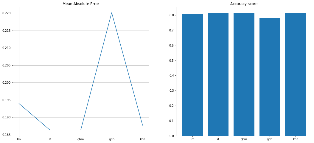
Apparently the Random Forest Classifier is the best compared to the rest due the time Gradient Boosting needs to perform the training and testing with a 81.36% accuracy.
Did you like this exercise? Do you want to find new datasets to train your skill as a data scientist or a machin learning engineer? I highly recommend Kaggle where you can find a lot of datasets, create your own notebooks, participate in paid challenges (Sweet money, oh yeah) and, of course, see other highly professional data scientists notebooks and how they solve machine learning problems. Thanks for visiting this post and see you around ;)